Wasabi Rabbit
Wasabi Rabbit is not a client. It’s where I work.
Wasabi Rabbit merged with Barnum Design.
A new entity was born. A new identity was required.
So began the process of designing distinctiveness.
(Spoiler: It turned out amazing!)
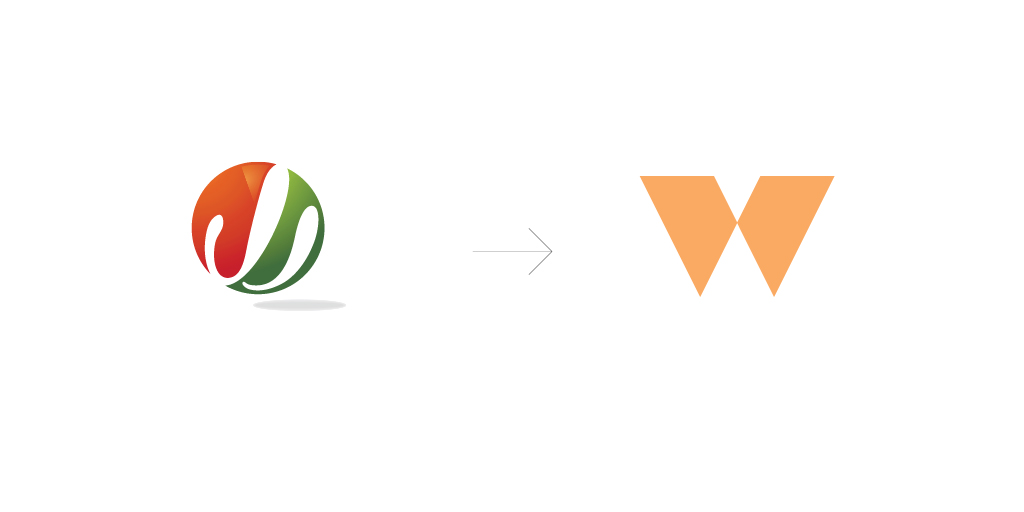
It was hot. It was fast. It said nothing.
Wasabi Rabbit literally meant ‘hot & fast’. It was unique, but that’s where the fun ended. Add to that a pretty vague tagline; Daring. Driven. Delicious. – and we didn’t have much. The logo was a floating ball of red and green leaves where the negative space made a lazy attempt to look like rabbit ears, three ears to be precise, just so that it could double up as ‘w’. The logotype tried too hard to say nothing. So it all added up to a big nothing.
But then there’s got to be something to a brand that underwent a merger and grew almost 200%. We were insistent on finding that something. Things were beginning to ‘wasabi’ up. So we started looking for the rights and the wrongs.
Read the brand discovery storyThe wrongs
The name didn’t resonate with the brands’ new found philosophy - ‘Delivering Effectiveness’. In fact the name promised to deliver something else completely.
The second major wrong was blurry vision. There was no clarity of the category that the company saw itself in. We are not just another digital marketing agency, but then what are we? How are we different? And how do we show that distinctiveness through design? Now you know why we called it the wrongs.
What we see is influenced by what we expect to see. Expectation can be useful. However, it can distort perceptions too
The rights
Thankfully, we had faced such situations before at Barnum.And we had preached a certain process to all our clients. Now it was time to practice our own preach.
Don’t jump into cute, clever designs straight away. First understand and get clarity on the business value proposition. We were thorough. From re-crafting our offering to arriving at the brand brief through our brand opener methodology. From defining the brand personality to applying ideas of brand archetypes. Phew! We were getting somewhere.
We began to see ourselves as explorers, with a side of sage and a creator. We questioned ourselves. What brand type are we? Definitely not the cohesive and adaptive types. Surely not the comfortable in habit type. We were chaotic. Yes that’s about right.
Show less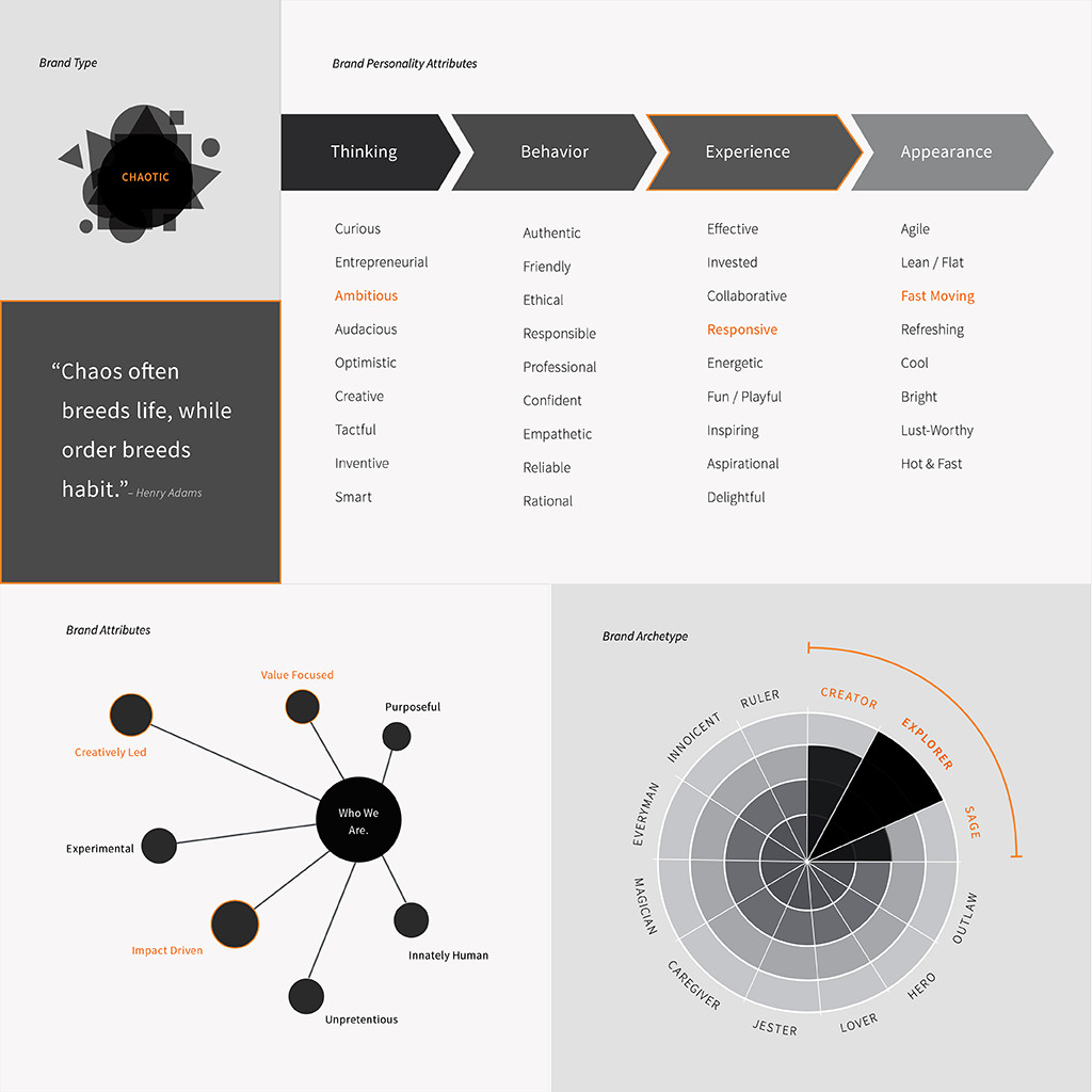
Wasabi Rabbit was more than a funky name. In fact that became one of our first objectives for designing the identity. Downplay the name, project the purpose.
Strategic ambiguity is a concept I had learned about, and we applied that concept to create an abstract mark that represented more than the name. An identity system that enabled the mark to be used independent of the name. A mark that helped us discard the old and instil a new vibe to the Wasabi Rabbit identity.
We Found Us
Or at least we were beginning to in words. We had found words to our purpose. We had found the new Wasabi Rabbit - Impact Driven, Value Focused, Purposeful, Creatively Led, Experimental and Innately Human.
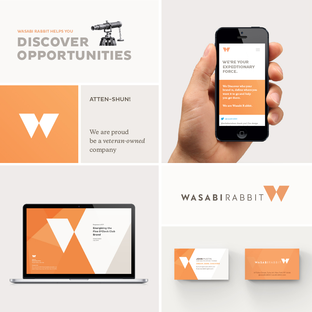
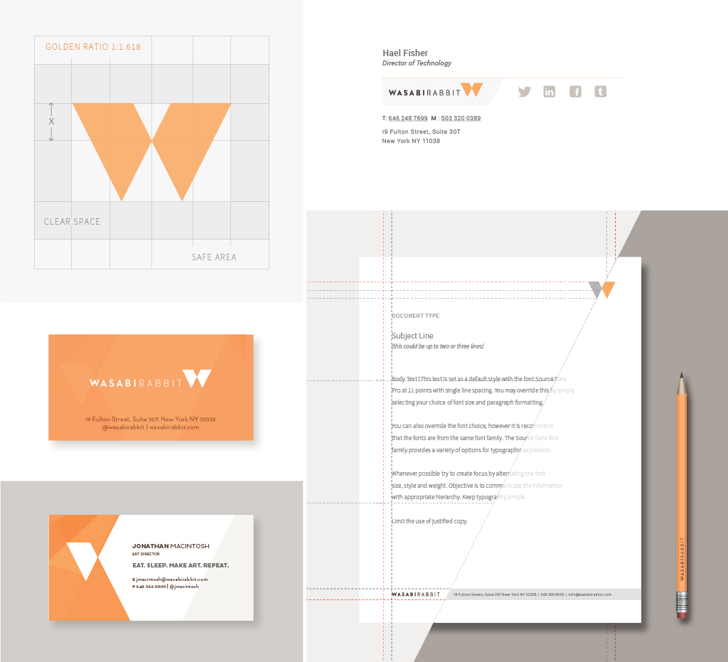
The Logo. A Solid ‘W’.
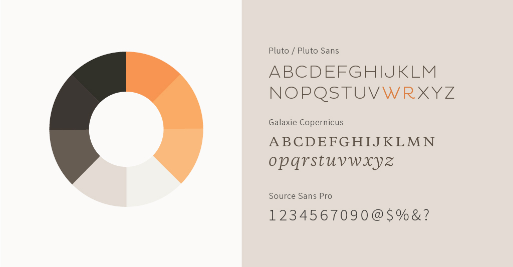
Sharp edges, defined angles, and calculated proportions. Yes that’s what we came up with. A solid ‘W’. But it wasn’t rocket science. It was a solid ‘W’. Simple, rather clear. Just like the new Wasabi Rabbit; Diligent, Focused, and Committed.
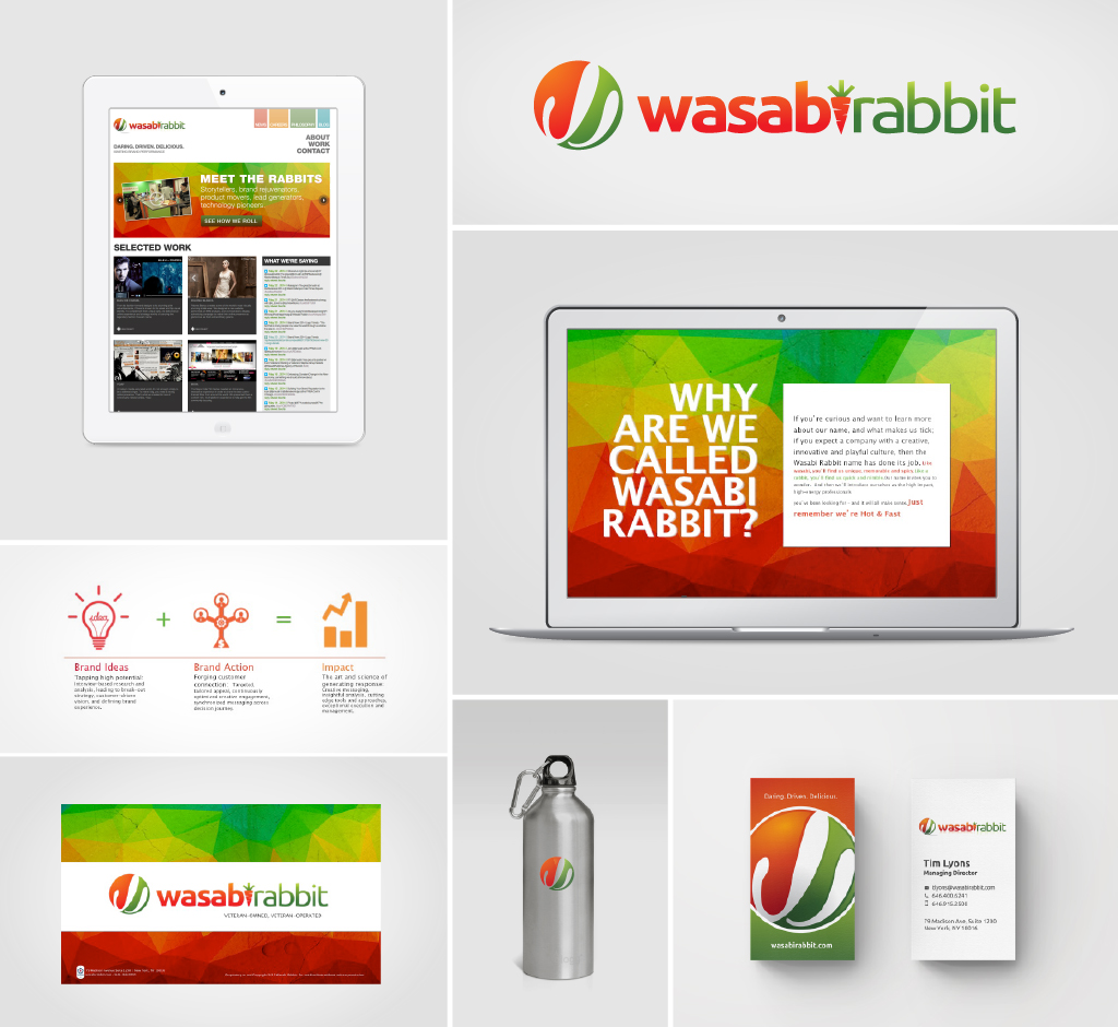
Once we had the solid ‘W’ in place we began to play with it. No puns No gimmicks. No nonsense. Just a fresh coat of paint. A logotype that aptly complimented the brandmark. We were set. We crafted a basic lockup for formal applications. But kept the door slightly ajar for individual expressions.
Read MoreBut then as we had said before, we are explorers. We kept experimenting with many versions of the ‘W’. The design grew in impact as we added a visual metaphor for growth. We crafted a graphic frame using the twin blocks of the mark. Converting this into negative spaces allowed us to frame elements within the larger block, while the frame itself served as a canvas that helped create context. We were on a roll.
The design inspired us to craft everything with due diligence and awesomeness. So we did. From typefaces to matched colours to messaging. From email signatures to digital letterheads to social media profiles to bios. From business cards to personal statements to the toilet seats (not really). We built the brand stroke by stroke, with one clear mandate in our heads – awesomeness.
Show less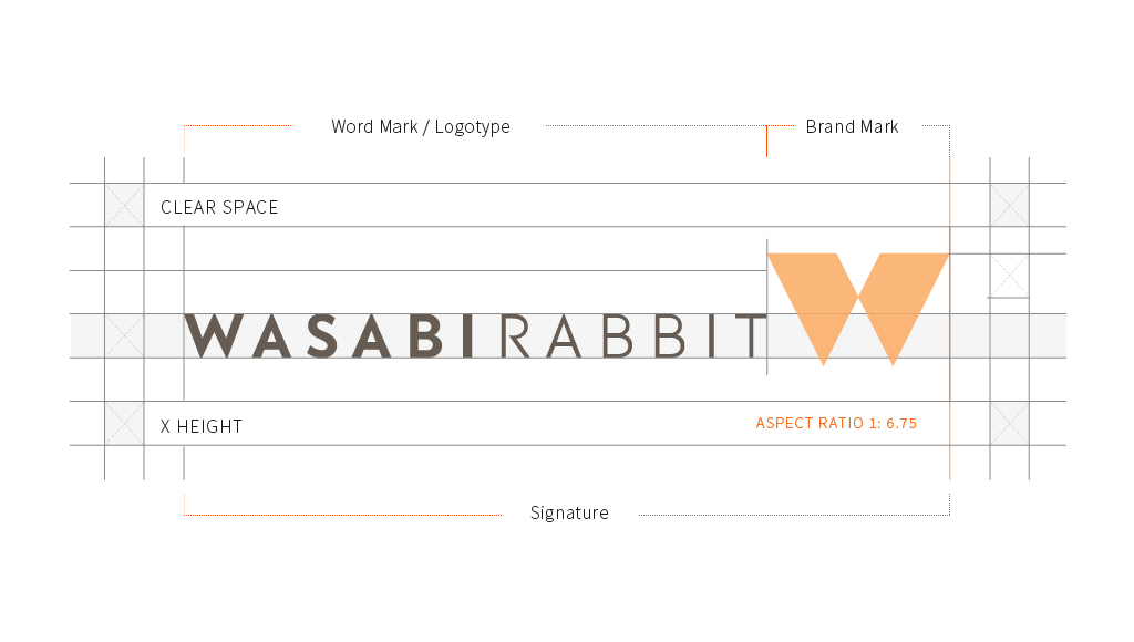
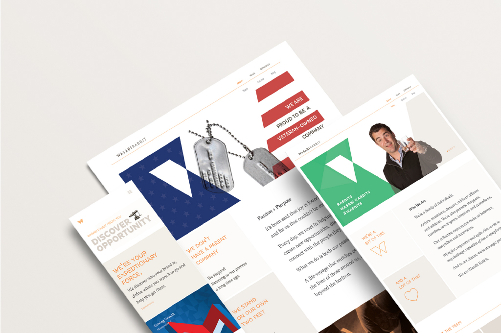
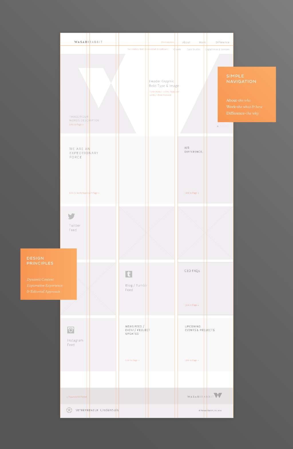
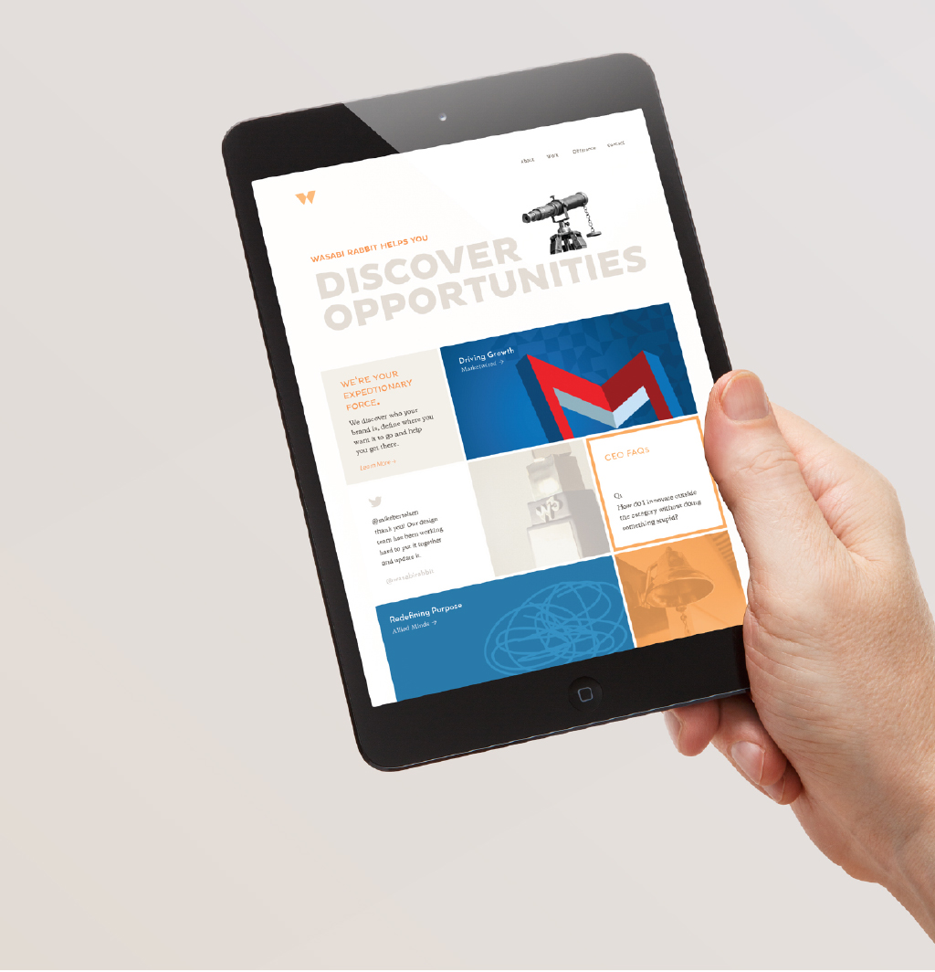
The Website
Of course we needed a website. And like all things in our industry we needed it quick. The merger was announced, we needed a landing page, so we made up a makeshift one. While we got down to crafting the new Wasabi Rabbit story, online. The identity exercise had already given us clarity, we simply adapted it for the new medium - Dynamic, Editorial & Explorative. The result was a fully responsive website that worked around three nav items: About, Work and Difference. The simplicity really set us apart overall. The story became engaging and interesting.
The project was a success.
Yet at a personal level, I had failed.
Let me explain. When you’re fighting to solve problems, it isn’t always about winning. As Jay Z says it, you learn more in failure than you ever do in success. I see my failure more valuable than the success of this project and here’s what I learned:
Believing is seeing.
Branding is innately human. An on-going effort to connect and reconnect with your audience. It’s a perpetual process of change. And there’s no absolute formula. It’s like working on a dream, a hunch. A belief in a better product. A better future. And it’s easier to design the future if you can visualize it. If you believe it, you can see it.
The whole is not always more than the sum of its parts.
This is a tricky concept. It resonates with the Auteur Theory of Design where John Gruber argues that The final product of a collaborative endeavor reflects the quality embodied in the decisions and tends to approach the level of taste of whoever is in charge. The crux however, is to see design as decision. And decisions can either constrain solutions or imagine possibilities. Rebranding projects are uniquely challenging. And communicating design decisions intelligibly is just as important as the design itself.
From Identity to Culture
This was a unique first-hand learning. Culture is the brand equivalent to an internal audience. We redesigned how Wasabi Rabbit looked and revamped what we said. We set the tone for how we want the world to see us. But we are yet to translate it into our identity. We are yet to live our brand—create a culture that aligns with our vision of the brand. Hopefully we’ll get there. but for now, just like the branding process, we’re all a work in progress.