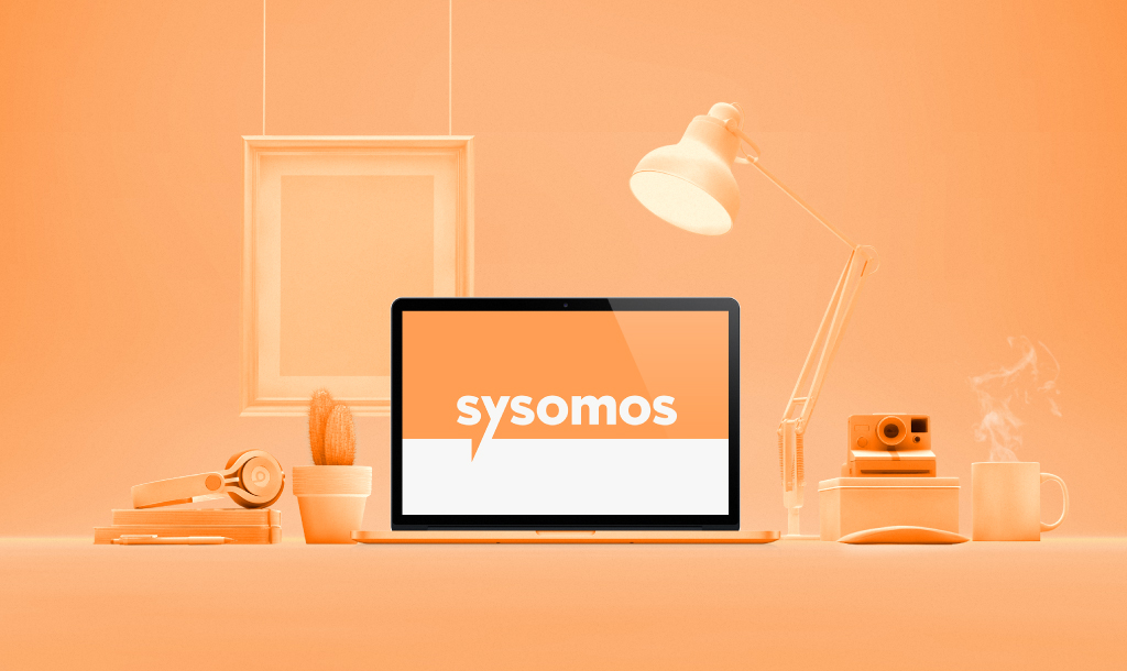
Sysomos Inc.
Once there was a media analytics company.
Toronto-based (don’t judge me) I must add. Then they
were acquired. And Sysomos lost its identity.
This is the inspiring story of how we helped Sysomos
rediscover itself. In the end there’s a twist.
There are problems.
Then there are wrong problems
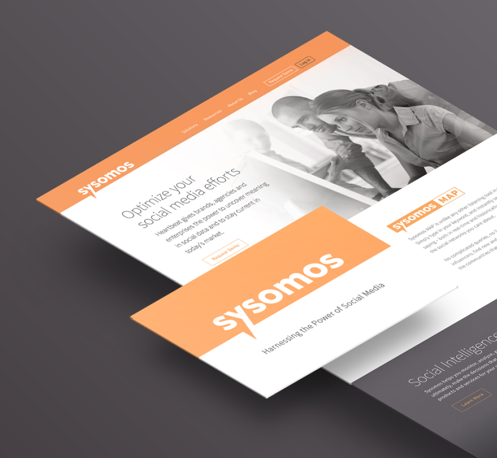
A wrong problem begins when there’s more focus on corporate ego flattering than logical problem solving. Which in this case led to people ignoring the existing equity of the brand and trying to overhaul just for the sake of rebranding. Rebranding was the wrong problem. What Sysomos needed was a refresh. A nudge towards the new-age, a tweak to align it with its new found voice – the newer, bolder Sysomos.

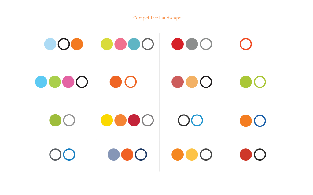
Weakness turned to strength.
Armin’s review of the Dow Jones rebrand had left a strong impression on me. I was awed by how amazingly it turned the weakest element in the old identity to the strongest element in the new one. Lesson learnt. Now let’s practice.
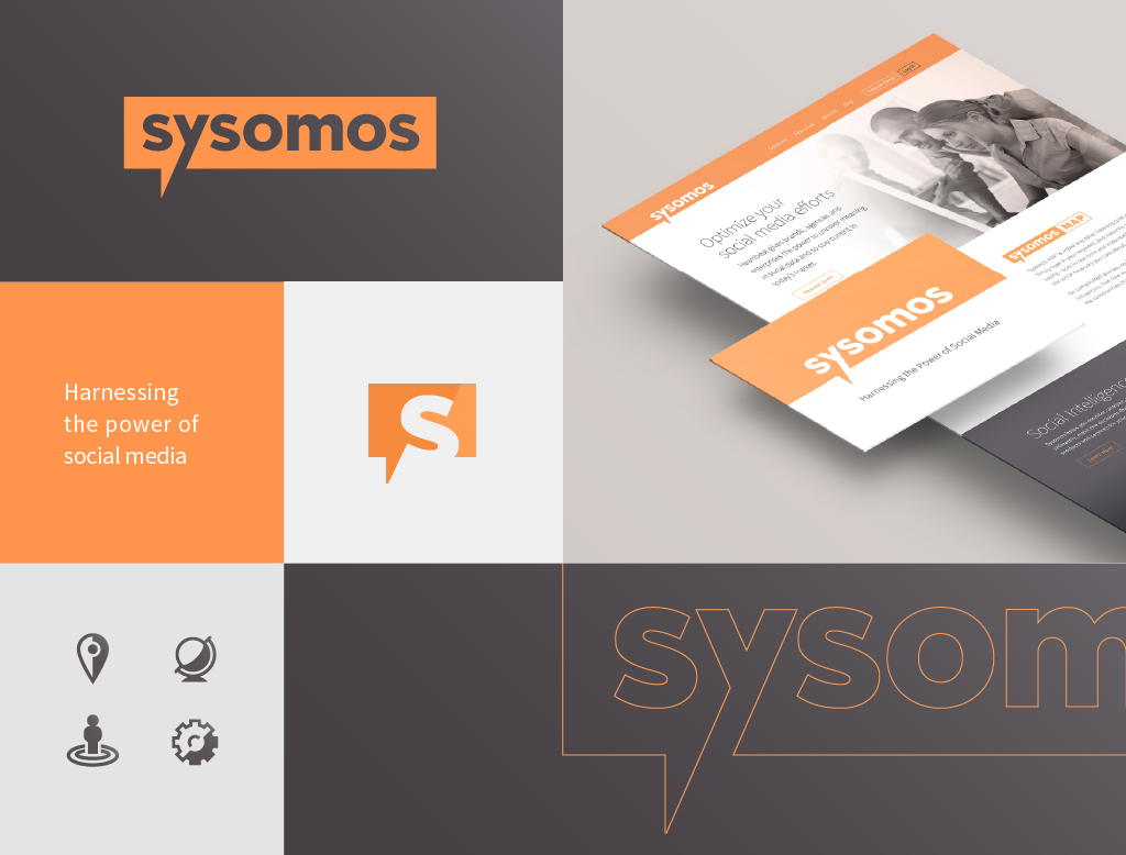
Sysomos had a strong equity. How do we leverage it? How do we turn it’s dated identity into a new strong statement?
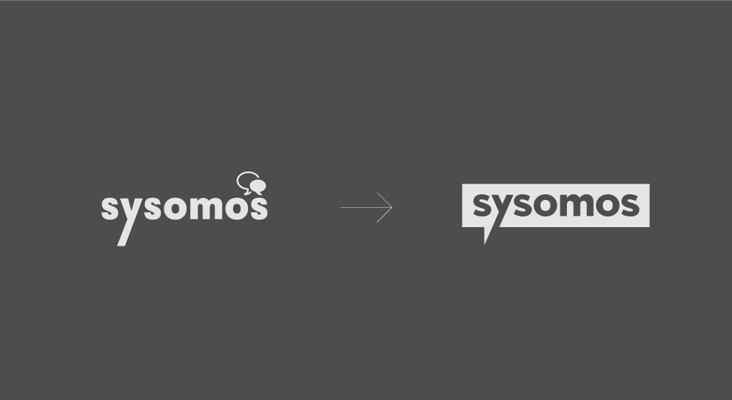
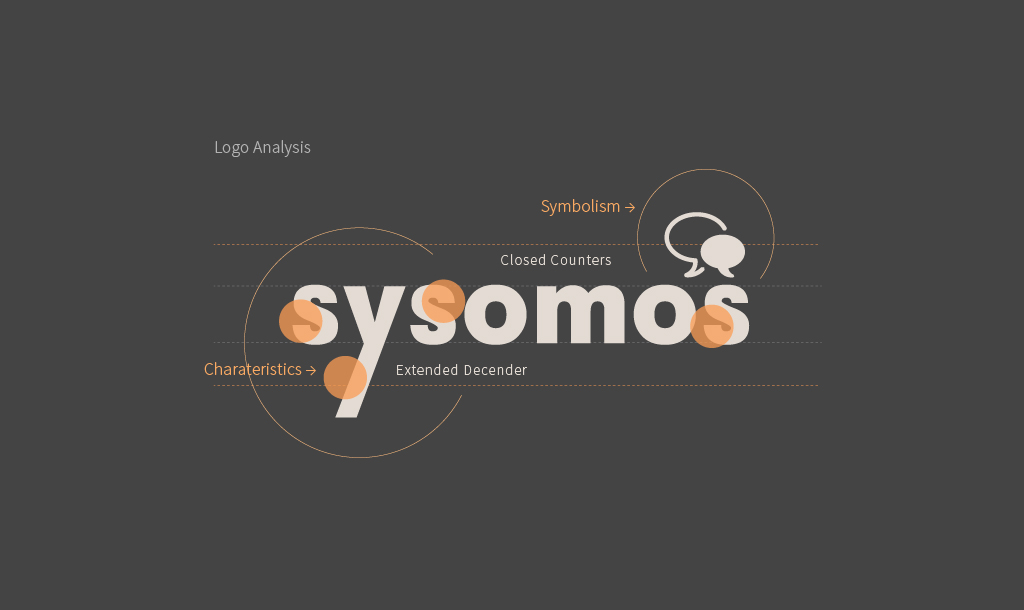
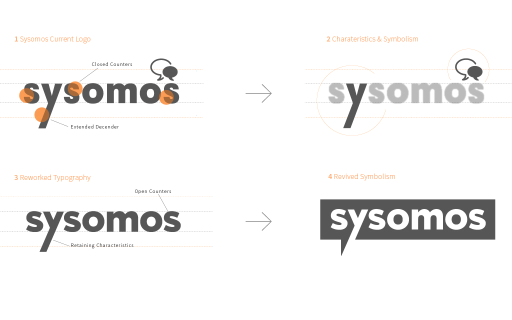
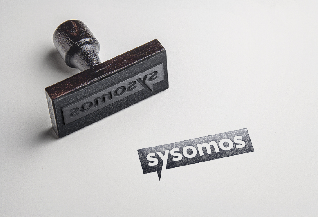
Read MoreOur renewed focus had led us to see Sysomos in new light. We stripped the corporate cladding and started with the logo. We stared at it. Long and hard. Then longer and harder. Shred it one element at a time- the color, the shape - until our eyes started hurting, until we found its individualit‘y’. The extended descender of the ‘y’ in Sysomos. We had found our spark, before we could run with it we had to get rid of the speech bubble - conceptually relevant, but heinous in design sense. We knew we were designing a word-mark. We knew it was going to be fun.
Crafting each character, opening the counters, simplifying the strokes, we realized, the word-mark would not cut it on its own, we needed more. More fun perhaps. So we started making fun of the heinous speech bubble and then we remembered the inspiring ‘turn weak into strong’ words from the Dow-Jones identity model. It was more of a flash-forward than a flash-back. The speech bubble had spoken. We re-crafted the speech bubble converting it to a holding shape. The extended ‘y’ snapped just perfectly to align to its tail while effectively popping up the word mark. We wondered ‘y’ didn’t we think of this before? But then there it was. What fun!
Show less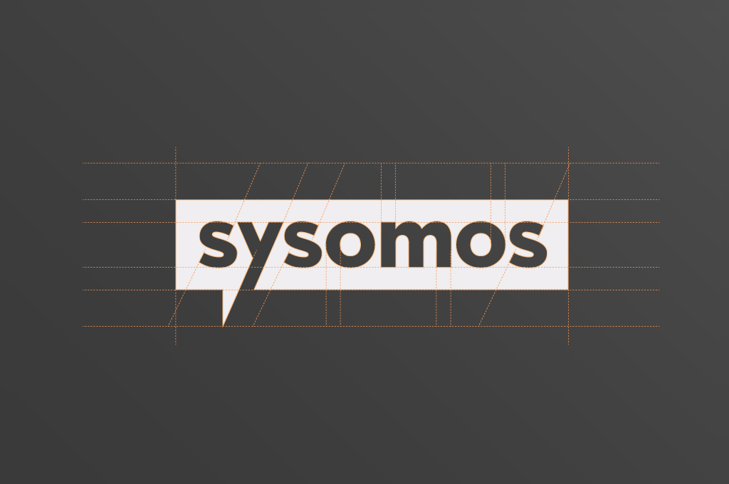


You win some. You learn some.
Remember we told you there’s a twist at the end. It’s a happy one. The project never got released. So why do I still consider this project worthy enough? Cause I didn’t win, but I learnt. I saw what others didn’t. I backed my instincts and was pretty happy with the results.
What did I learn? That it’s not okay to assume that a rebranding routinely demands a new logo. I am glad Sysomos didn’t end up using any of our logos. Because Sysomos never really needed a new logo. All it needed was an update.
Rebranding is a strong concept. It’s a critical decision that should evolve out of questions like, What business problem are we trying to solve? What do our customers really want? What equity do we stand to gain or loose? Not because the title on the brief document says rebranding. So that’s the Sysomos story. And in the end we all lived happily ever after.